
Pretty colours...meh...give me drama any day

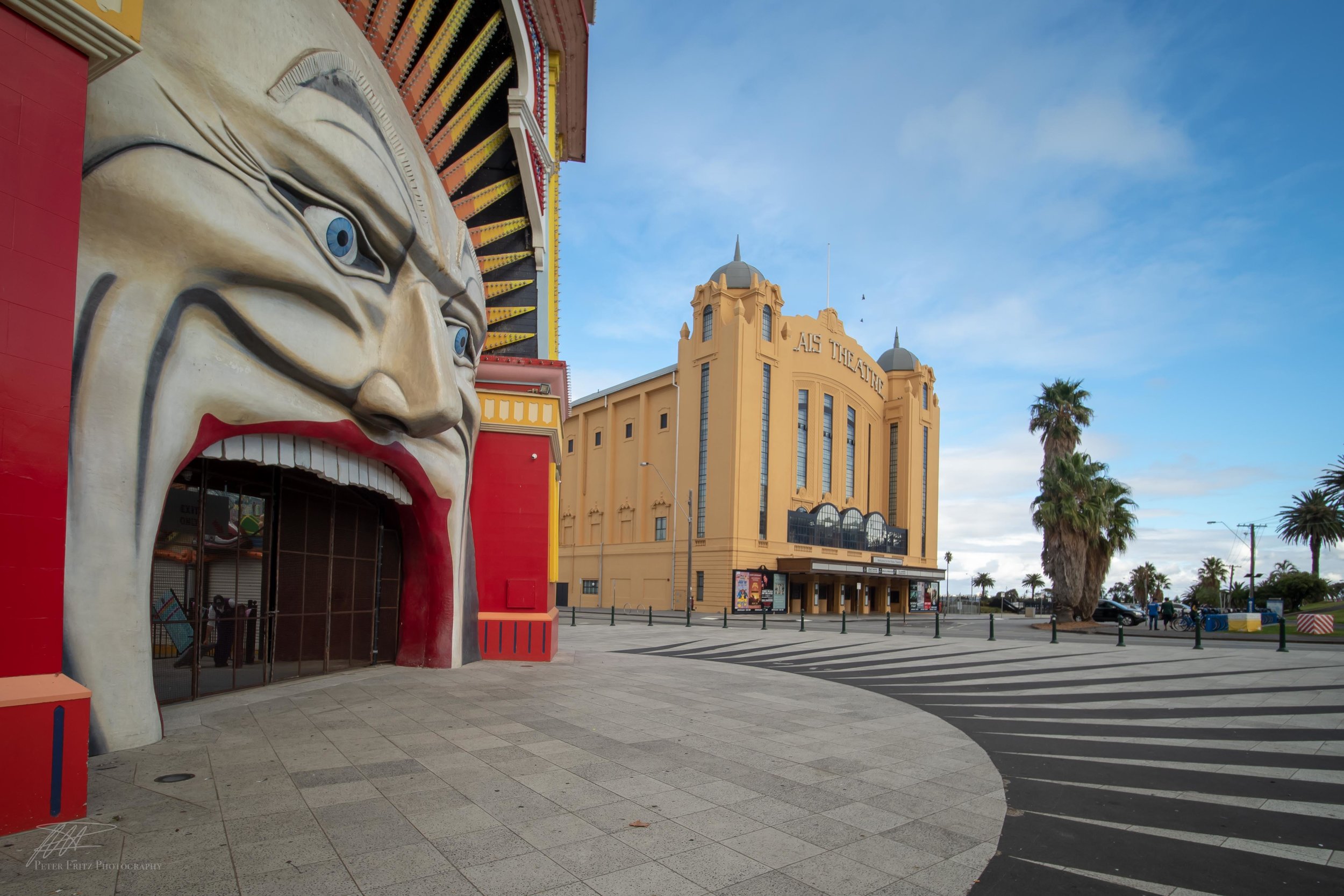
The almost menacing nature of the face in BNW is at odds with the ‘Luna Park…. Just for Fun’ theme we’re accustomed to.
Why limit yourself to colour photography of landscapes when black and white offers so much more. Now don’t get me wrong, I love a fantastic colour photo as much as the next person but the issue is fantastic colour photos are hard to acquire and in my opinion there’s a lot less scope for artistic expression in the editing of them.
As I mentioned in my last post, the “pretty” colours that make colour landscapes interesting occur for a brief period of time twice a day and often not at all, depending on the weather. If you’ve been disciplined enough to get out at the right time and fortunate enough to capture those spectacular colours at either end of the day, there is still a lot less you can do with the image. Yes you can tone down the highlights, open the shadows, add a little warmth and vibrance but once you start going a little crazy with the saturation slider and white balance things can start to get a bit freaky. I’ve seen plenty of photos on social media showing excessively pink/purple/orange skies that you might only expect to see on the planet Jupiter during an acid rain storm and greens on moss and seaweed so vivid that they resemble glowsticks at some rave party! It happens when people slide to the right a little too far with the old saturation slider.
While an interesting angle, there’s nothing particularly emotion provoking in this image.
So if you haven’t managed to get that amazing sunset you're actually in luck, as you are now free to express yourself in a whole different way. Converting your well captured image to black and white opens up a whole range of possibilities. High Key, low key, high contrast, low contrast, lots of clarity, minus clarity do what you want… the photo is your canvas. You are free to create whatever image you like because it has been removed from the constraints of what we think it should look like if it was in colour. One of the most satisfying things for me is to create an emotion in the photo that wasn't there in the original image. For example the Luna Park picture in colour is a “nice” picture, but for me that’s where it ends. By converting it to BNW and adding contrast and highlights to certain areas I’ve tried to change the mood of the photo. The face almost looks menacing with the black spikes radiating away on the ground and the dramatic clouds with the black crows circling above. It’s completely at odds with the fun theme park feeling you associate with this facade.

This BNW edit has made the clouds look more dramatic around the periphery of the sky allowing the light in middle to draw the views eyes to the centre of the image.
Disappointing sunsets like in the image below can be transformed into far more dramatic scenes. By selectively darkening the darker parts of the sky and highlighting the lighter clouds a more foreboding storm-like appearance can easily be created. This also helps to draw the viewers eye through the scene to the headlands in the distance creating a sense of depth to the picture. Highlighting specific parts of the backwash in the foreground exaggerates the effect of the long exposure flow of water and also helps to draw the viewer into the scene. So next time you’re looking disapprovingly at your colour photos, change your mood and that of the photo and have a go at editing them in black and white….you might just have fun.

A lacklustre sunset at Smiths Beach despite fantastic clouds and great movement in the water.